
Meditation App for Creatives
Concept
I designed the visual design of a mindfulness app tailored to enhance creativity for designers. This was prompt
Role
UI Design
Team
Solo Project
Duration
One Week
Tools
Figma
Background

Context
This project originated from a prompt. The prompt: Meditation App for Designers
Understanding the Prompt
To arrive upon an identity for this app, I wanted to understand why designers want to practice mindfulness with this app:
-
Enhanced Focus: Mindfulness improves focus, essential for designers who must pay attention to details.
-
Creativity Boost: Mindfulness clears the mind, fostering innovative thinking crucial for designers.
-
Emotional Awareness: Mindfulness enhances empathy, aiding designers in understanding user needs for user-centered design.
Explore the App
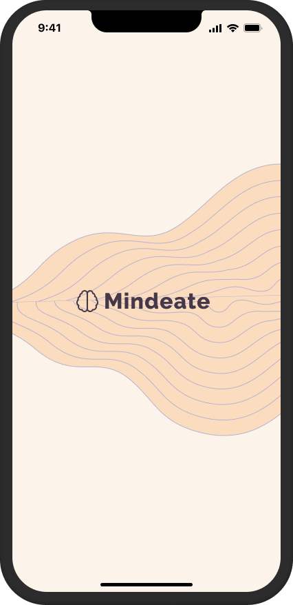
Onboarding Screens
The onboarding process starts with design elements featuring waves and single-line illustrations. I aimed for this screen to exude a sense of minimalism and fluidity in its appearance.


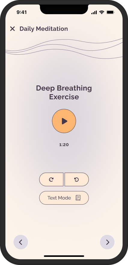
Home and Meditation
The home screen continues with the design language of using subtle colors, waves, and minimal illustrations.


Design Ideation
Brand Identity
Creative, Youthful, Simplistic
Colors
I wanted the colors to be match the words I've chosen. I refered to the various articles on color psychology to choose colors that fit my description. Using muted shades of chosen colors ensures they are not loud or jarring, creating a subtle and subdued aesthetic.
Brand Colors

Orange signifies warmth, enthusiasm, and energy, often linked with creativity and innovation, evoking excitement and vitality.

Purple symbolizes sophistication and is associated with creativity, imagination, and spirituality, evoking calmness and introspection.
Extended Palette

Fonts
I opted for the Raleway font to align with my brand's free-flowing and curved personality.


Design Elements
I utilized lines and single-line illustrations to evoke a sense of fluidity in the design, resembling a relaxing and rhythmic flow.


Wireframes
Based on my references, I worked on some wireframes to give shape to my final design.

Wrapping Up
What I Learned:
I approached design analytically rather than relying solely on intuition. Instead of basing decisions on my own emotions, I sought evidence-based rationale for design choices. For instance, colors were selected based on established principles from color psychology articles.