Your AI Second Brain
US-based seed-stage Startup
2025
Reimagining human-AI interaction in TwinMind AI

Redesigning an AI companion app that captures what you see and hear, remembers it, and surfaces the right context, and next steps when you need them.
MY ROLE
UX Designer
TIMELINE
2 days
TwinMind is an AI companion that listens to your conversations and voice notes, helps you retain what matters, and brings it back later through summaries and answers. This project is my redesign (based on their design brief) of its core experience to make the AI feel seamless and intuitive.
THE PROBLEM
The app’s current user flow felt fragmented and inconsistent—too much was happening at once. For a recording app, data capture wasn’t at the center: record it… and then what? There was no clear retention loop either.
THE APPROACH
For a ‘second brain’ tool, the app currently feels too mechanical, impersonal and lacked any value add into the user’s life.
My idea was to leverage LLMs to add real value to a person’s life by turning voice recordings into rich insights, reducing mechanical tasks, and giving people a reason to return and record more of their lives.
In short, I want it to be the support layer that runs quietly in the background of your life.
I started by auditing the app
I played around with the app to experience the onboarding > home > information capture > reflection flows. Apart from auditing for usability heuristics, I wanted to understand how the app approach building a relationship with the user.
-
What are this app’s functions?
-
What value does it currently bring to the user?
-
What makes people come back?

Fragmented flows
-
There’s too much happening in the app—it feels like a palette of buttons with no clear, linear flow.
-
The terminology overlaps, with two different buttons essentially serving the same function.
-
There’s little hierarchy, so it’s unclear what’s most important on the screen.
-
There are very few opportunities to correct or edit things.


No structure for reflection
-
Recordings are stored linearly, creating a long chain of notes with no grouping or categorization.
-
There’s no way to cluster related notes to build broader context.
-
Revisiting something from a month ago becomes much harder to find.
-
Short recordings (e.g., 10 seconds) become standalone “thoughts,” even when they belong with other notes.

Doesn’t reduce the memory load
-
The home page insights pull recordings in too many directions—action items, streaks, suggestions, etc
-
It misses the core purpose of a second brain: reducing mental load by turning recordings into clear, actionable takeaways.
-
A real assistant surfaces what you might miss throughout the day.
-
Here, it tries to do everything at once and ends up giving you too much.

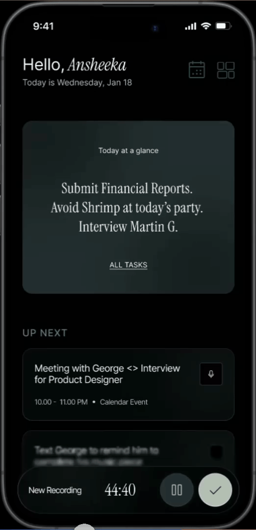
Friction in information capture
-
The recording screen lacks basic controls like pause, stop, and delete.
-
It doesn’t feel conversational or companion-like—there’s no sense that something is “listening.”
-
Aside from the timer, there’s little personality or motion, and it’s easy to miss that recording is active.
-
Status feedback is unclear: there’s no strong indication of recording start, recording end, or when a note has been saved.

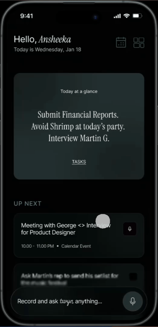
Proposed Flow

Capture + “ Hey, a quick question!”
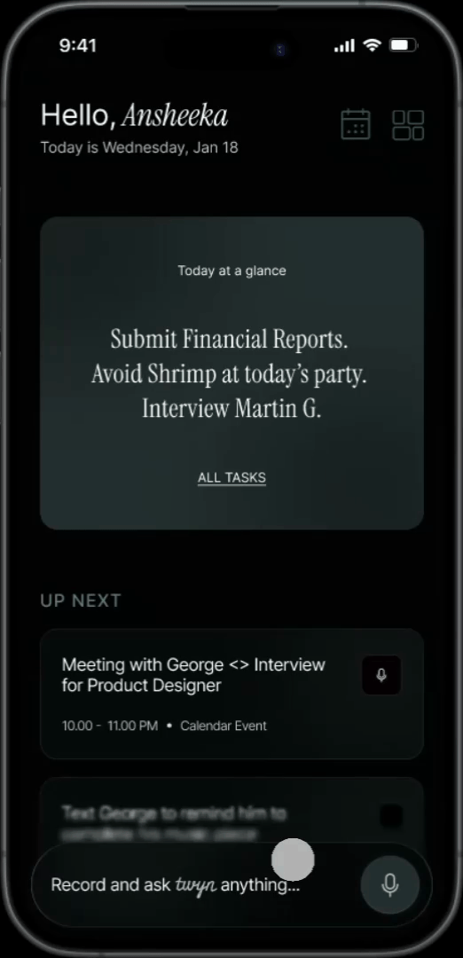
Summarize + Synthesize + Correct
Review + Interact
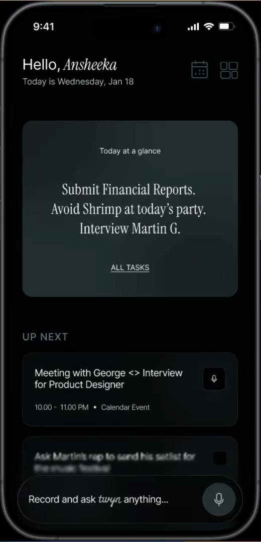
Organize + Use + Nudge
Light vs. Dark
-
I chose dark mode and reimagined the experience as dark-first to make it feel quiet, focused, and ambient—like an assistant that’s always there without demanding attention.
-
Dark surfaces help the UI fade into the background, so the user’s voice, context, and key takeaways stay in the foreground.
-
It also better fits the primary moment of use—capturing and speaking—often happening in low-light, on-the-go settings where bright screens feel intrusive.
-
With careful hierarchy and contrast, dark mode supports long sessions of listening, reviewing, and recalling without visual fatigue.
Learnings
Heuristics for AI Products
This project allowed me to explore the yardsticks we measure human-AI interactions with. I studied Microsoft’s HAX Toolkit, IBM’s materials on ethical design for AI, and many others to formulate this experience.
Gradients and Glass UIs
This project allowed me to observe how gradients and opacities work around me; I started observing my surroundings, how the sun hits my window and forms shadows that blend into one another, how my smart TV ensures the content behind it isn’t overshadowed by the text and controls, etc. It helped me bring natural gradients into my work.