Simplifying recruitment pipelines for healthcare recruiters
ProRank
2024

MY ROLE
Product Designer and Researcher
TIMELINE
October ‘24 - September ‘25
COLLABORATORS
Product Manager, 2 Developers, CTO, CEO
THE PROBLEM
Fragmented workflows, and platform inconsistencies prevented recruiters from filling positions quickly.
THE CHALLENGE
How might we simplify a recruiter’s decision-making by reducing cognitive load and streamlining the sourcing and communication process
SOLUTION A
Audit and Redesign
Conducted a heuristic audit and redesigned core recruiter screens, creating a unified design system to reduce cognitive load and ensure visual consistency.
SOLUTION B
Introducing New Features
Designed new features to support candidate search and outreach, including an in-situ SMS client for organized communication and tools to match and clean candidate data.
IMPACT
$3M
seed funding
5x
more placements
~3
placements/week
40%
development time
SOLUTION A
Redesign driven by a heuristic audit of the existing platform
I conducted a heuristic audit to uncover inconsistencies in layout and terminology.
I then redesigned the core screens like the dashboard, sourcing pages, candidate information pages, etc to reduce cognitive load.
Created a design system to ensure consistency in visual elements, space and order throughout the platform.
1
Dashboard
Shedding light on status of job pipelines
The jobs dashboard gives a recruiter an idea about the health of a job pipeline, where candidates are in a job, and what stage needs intervention. It also fosters accountability because you see what your team is upto
Here’s how I transformed it.
Information Visibility
The table lacks visibility into candidate pipeline stages, making it hard for recruiters to track job progress and spot bottlenecks.
Filters & Controls
Overlapping filters & scattered controls create confusion; users mainly use ‘Assigned to Me’ and need clearer sorting criteria.
Layout & Spacing
The top and left navigation compete for attention, while tight vertical spacing makes the interface feel dense and visually heavy.
2
Candidate search
Making decision-making easier
The candidate search is the heart of ProRank — where recruiters discover, filter, and engage the right talent through job archetypes with tailored search terms that precisely match each role’s requirements.
Users found the space overwhelming, with the priority system overshadowing the pipeline. Here’s what I did:
AI Summary
An AI summary of the search terms and job archetype gives you a bigger picture of the search.
Filters
Enabled pills & inline editing of key criteria to reduce clicks and streamline the search process.
Removed priority system
The priority system, along with the candidate pipeline, was making search too granular
Boolean Search
Enabled the visibility of boolean searches made in the ‘advanced search’ feature, reducing the need to open a new modal.
Clear pipeline stages
Added clear pipeline stages (Search → Source → Screen → Submit) for instant visibility into candidate progress and numbers.
Structured card layout
Introduced a card layout that surfaces key details upfront, and standardizing action placement for faster, more intuitive scanning.
3
UI Refreshes
Improving access to information and tasks
The platform was initially designed by the engineering team, who did an amazing job of laying out the features, making my job of giving the screens a UI refresh a lot easier.
Improved Hierarchy
Reorganized forms and tables into modular sections with clearer alignment, making data entry and scanning faster and less fatiguing.
Visual Modernization
Updated the interface with cleaner typography, lighter spacing, and softer tones to reduce visual heaviness and bring consistency across modules.
Consistent Patterns
Unified button styles, filters, and component behavior to create a predictable, system-driven experience across recruiter workflows.
4
Design System
Unified visual language for scale and usability
In my first week, I created the ProRank Design System to standardize UI components and documentation, reducing development time by 40%. It was an incremental project, and I kept building upon it as we added new features.

SOLUTION B
Designing new features to support sourcing good candidates, outreach and maintaining data quality
In-situ SMS client that allows context switching, using substitution variables and templates to keep communication organized across jobs.
Scheduler for automated SMS and Email outreach based on candidate stage, actions and time.
Created an internal tool to clean duplicate candidate records, that merges or eliminates records based on the latest data. Also created a tool that matches a ProRank record against rocketreach data to ensure data recency.
Analytics Dashboard to help recruiters track hiring efficiency and pipeline health at a glance.
1
Messaging
Facilitating direct outreach to candidates
SMS at ProRank happened using a third-party tool, which made it annoying for the recruiters to keep switching windows, and maintaining a clear line of communication. The SMS content itself was not standardized, and it required a lot of copy-pasting job titles, links, pay. etc.
_gif.gif)
Contextual Chat Experience
Designed an in-situ chat tray where recruiters can view candidate history, switch conversations, and stay organized across multiple jobs.
Integrated Communication
Brought messaging directly into ProRank, allowing recruiters to text candidates within their workflow instead of switching tools.
Compliance Setup
Simplified registration and number assignment (10DLC) through clear UI flows, reducing friction and ensuring compliant outreach.
2
Analytics
Visualizing performance through hiring data
Recruiters needed a single source of truth for performance to understand what’s working, what’s stuck, and where to improve. The goal was to understand:
-
Stages that move the slowest and need team intervention
-
Granular performance metrics of SMS and Email outreach.
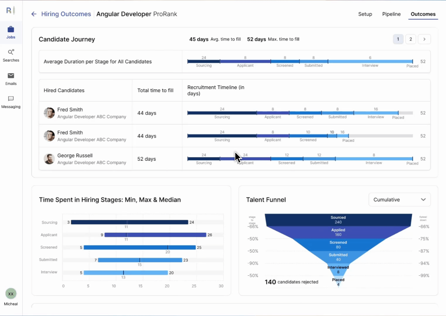
Designed a performance dashboard to track recruiter efficiency and pipeline health.
Created charts helping recruiters identify bottlenecks, optimize outreach, and measure overall recruiting performance.
Visualized key metrics—time-to-fill, stage duration, and funnel drop-offs—turning data into actionable insights.
3
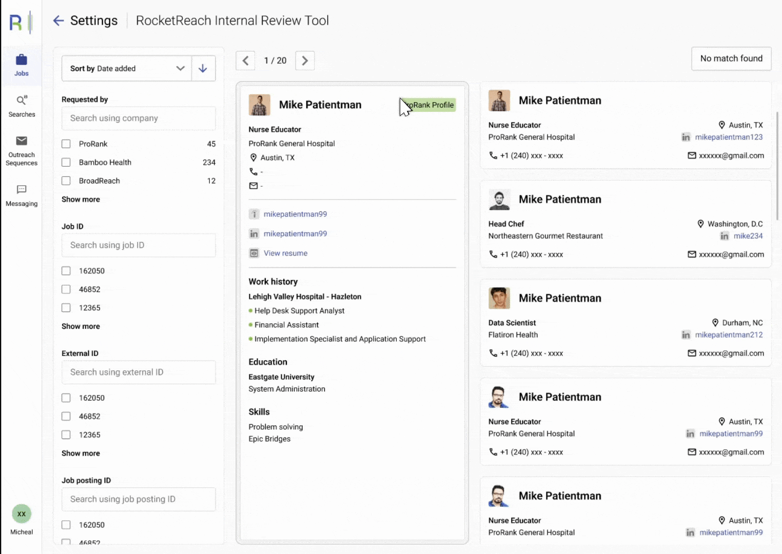
Internal Review Tools
Cleaning up ProRank’s data
The internal data review tools were built to reconcile information coming from multiple sources. They help recruiters verify, clean, and match candidate records — ensuring that data stays accurate, up-to-date, and consistent across the platform.
-
Goal: Improve data quality by ensuring up-to-date records, removing duplicates, etc
LEARNINGS
Open, constant communication makes being a design-team-of-one easier
Working as the solo designer was a masterclass in ownership, prioritization, and cross-functional leadership. Building the design system and rapid feedback loops enabled us to scale quickly and deliver real value. With more resources, I would have invested further in micro-interactions and visual polish—but focusing on speed and user impact was critical in our startup phase.
Team Alignment is really important
Alignment among key stakeholders (leadership, product and engineering) ensures we had a fair understanding of feasibility, need for a new feature, and what the clientele was thinking. Weekly product meetings were a goldmine of information.