Intuitive Infusion Pump interface to enable seamless drug delivery in clinical settings
Stealth Medical Device Startup
2025
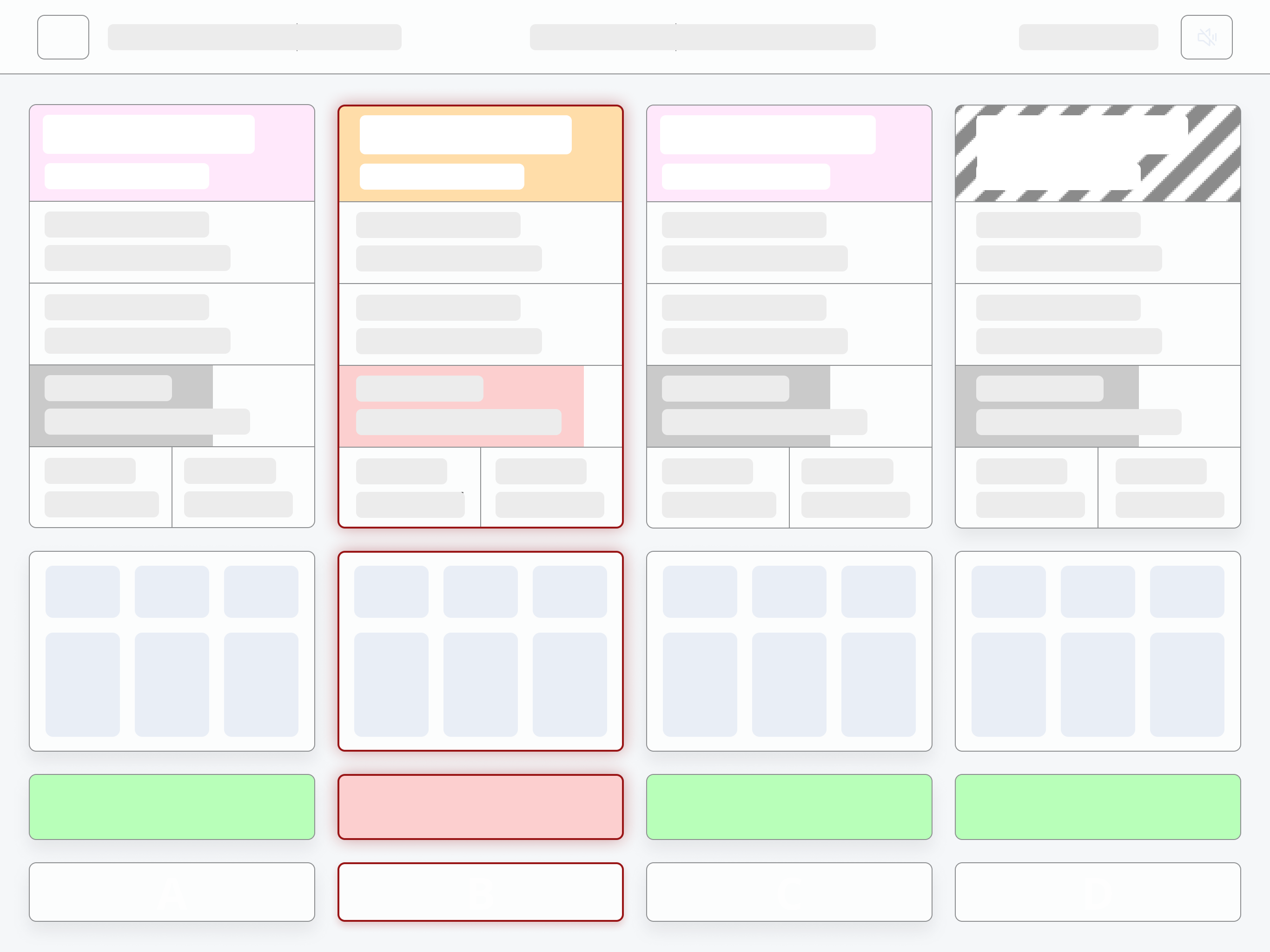
MY ROLE
Product Designer x Researcher
TIMELINE
August ‘24 - Present
COLLABORATORS
Client(Clinician), Embedded Systems Engineer
WHAT’S AN INFUSION PUMP?
An infusion pump is a medical device used to deliver fluids into a patient's body in controlled amounts. Used in ICU/critical care, surgery or ambulatory spaces.
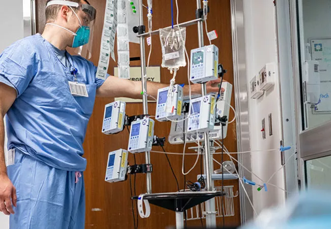
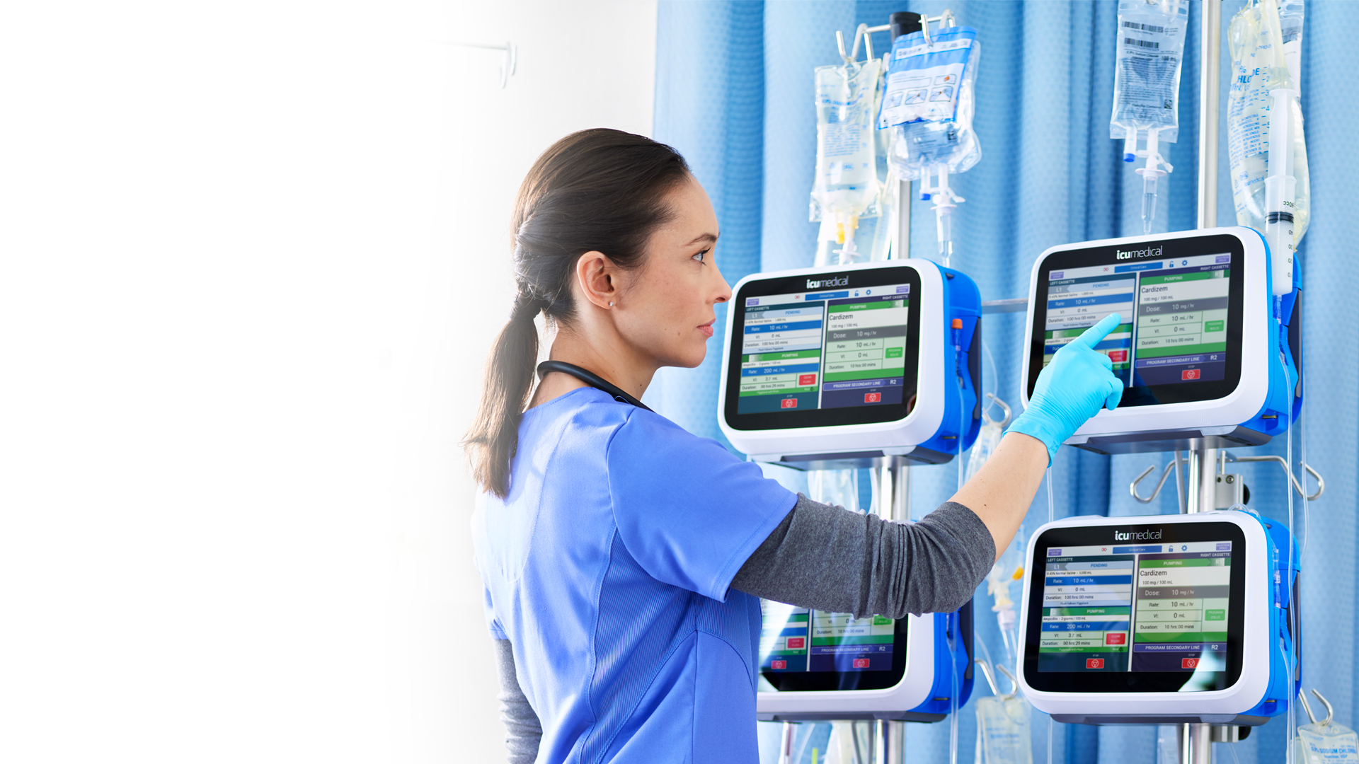
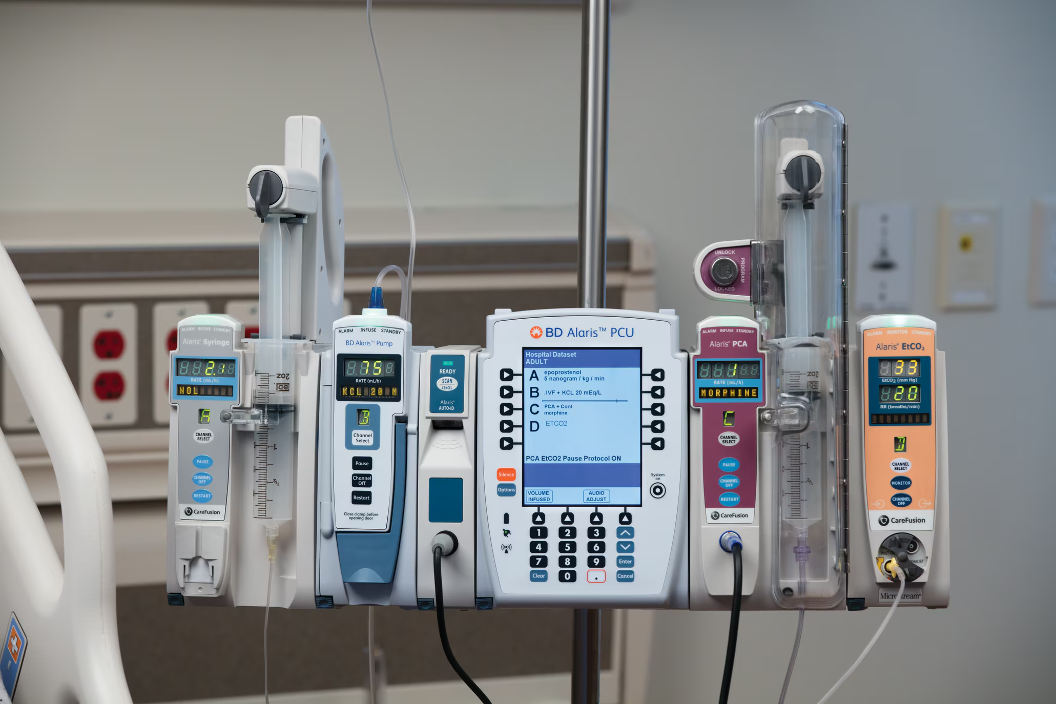
The competition
THE PROBLEM
Clinicians must manage parallel screens (upto 4) and overlapping alerts, fueling alarm fatigue and error risk.
THE FOCUS
A clean, intuitive UI for an infusion pump that supports clear programming, smarter alerts and a decreased margin of error
IMPACT
200k
Pre-seed funding
Problem discovery
The competitors
I did a deep dive into the competition, especially the market leader’s, to undersand how and why they work!
I checked for user flows, tactility, customization for different user groups, use of colors, fail-safes when error occurs
DISCOVERY
User flows are too complex for high-pressure situations. Button controls allow only a certain set of functions.
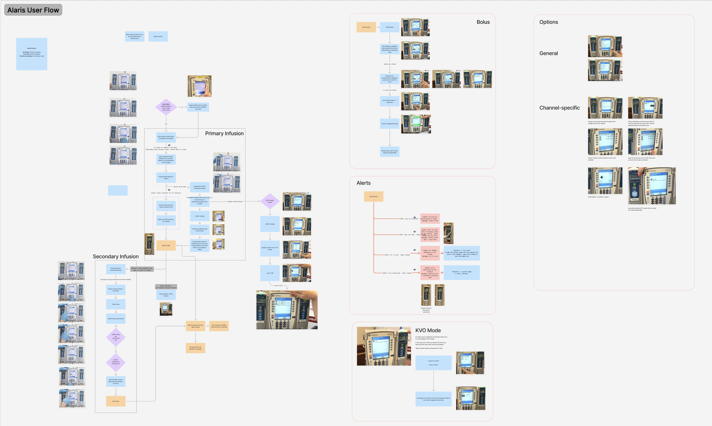
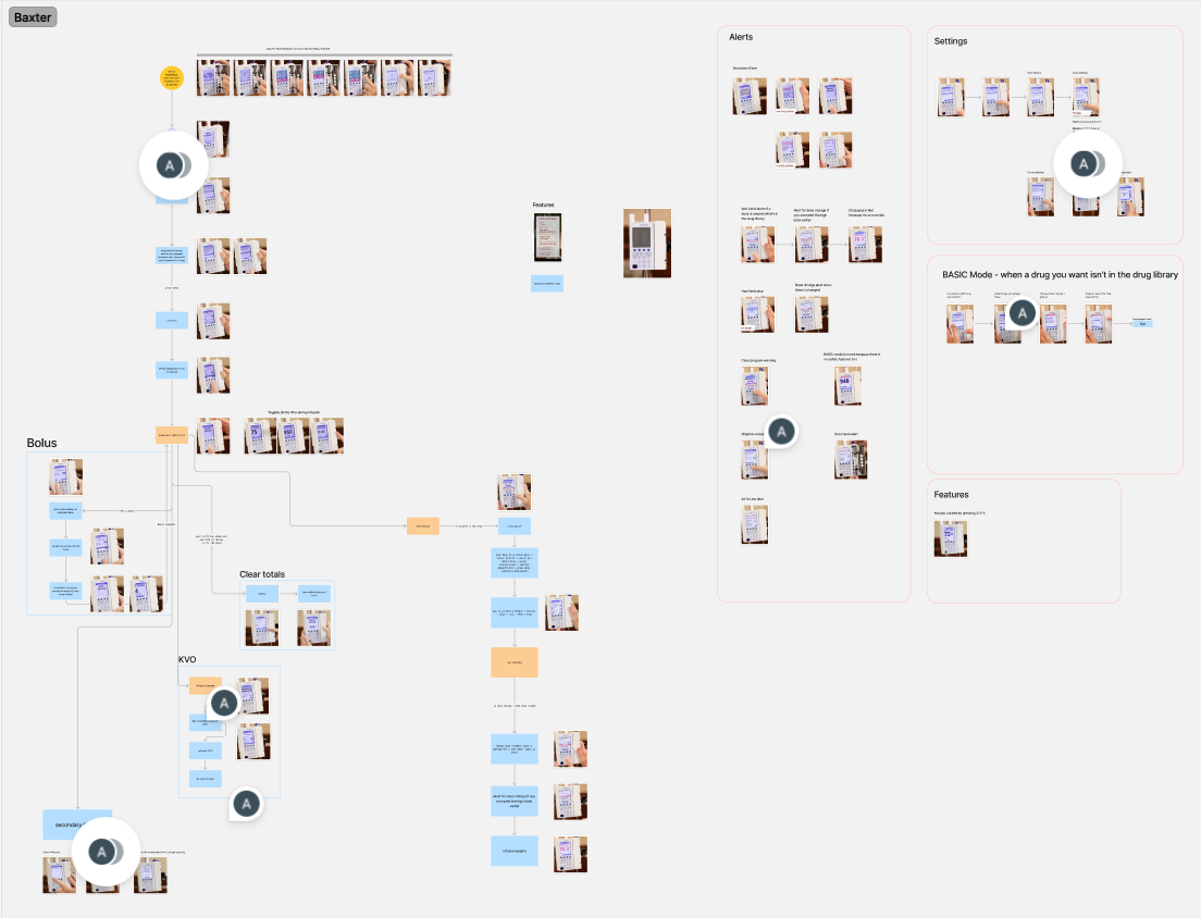
Single-channel pumps can be tough to synchronize with more than one infusion
Error correction takes time because of a linear navigation
Adjusting parameters mid-infusion is tricky and takes many steps
The users
I interviewed 3 clinicians + Client (a clinician himself) to understand their experiences. The main user group are anesthesiologists (using the pump during surgery), and nurses.
I also lurked on r/nursing and r/anesthesiology to get a wider understanding of the problems.
DISCOVERY
Alarm fatigue in healthcare is RAMPANT, resulting from desensitization to frequent alarms. About 80-90% of alarms are false or redundant.

This is a realistic number of infusion pumps that are used TOGETHER during surgery.
Four different pumps.
And they ring together!
Too many alarms = Overload =You tend to ignore a lot of them
Key information like drug labels, concentrations, bag capacities, are not visible at the same time
Clinicians manage several screens together - makes running simultaneous infusions challenging
FDA’s literature
I explored the FDA’s Manufacturer and User Facility Device Experience (MAUDE) Database to gather insights on mishaps specifically related to user interface issues.
DISCOVERY
Alarm fatigue in healthcare is RAMPANT, resulting from desensitization to frequent alarms. About 80-90% of alarms are false or redundant.
Accidental touch-related issues <> no fail-safes
Single point of failure. If a speaker fails, visual indicators are too small.
Not enough information about what stops the alarm (mitigation)
Constraints/considerations from FDA
FDA’s Applying Human Factors and Usability Eng. to Medical Devices lays out considerations for design that would allow the device pass inspections seamlessly. Some of them are as follows.
Mental Models
Use familiar user flows from existing devices to avoid confusion, training time & cost
Style Guide
To avoid confusion like between drugs, use tall-man case:
eg. predniSONE
vs
prednisoLONE
Contexts of use
Consider low-light, noise, mobility (moving the pump between rooms)
Sound controls for varying hospital rules
Adaptability
Allow customization based on user, context, permissions and training levels
Learnings
Don't shy away from reading really long books about the problem.
Insights can be found in the wild. Reddit is a goldmine.
When creating an interface for health, it's really important list and validate your assumptions with the users, early on!